
Announcing Visualizations, now live in Equipe.
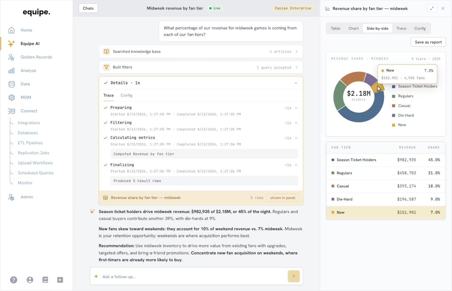
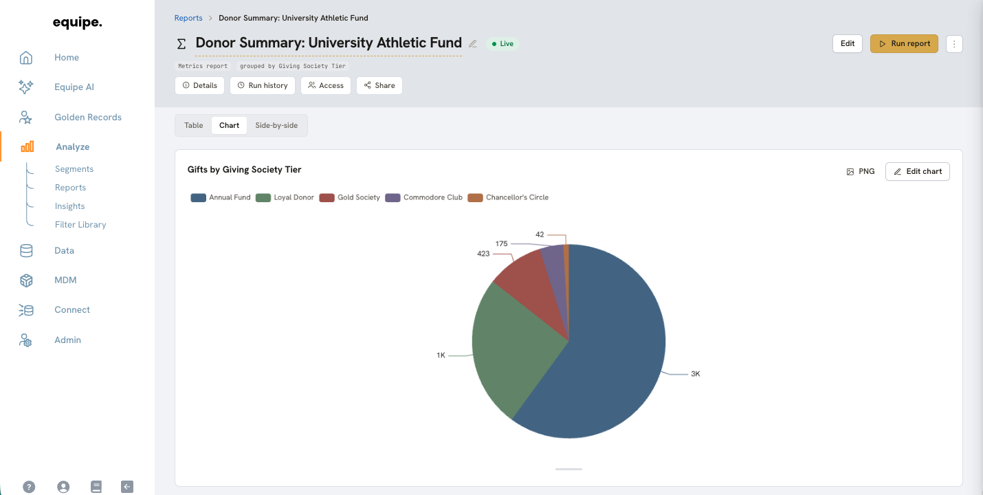
Equipe now turns any report into a chart, right on top of your clean, unified data. See your table and your chart side by side, drill straight from a chart into the records behind it, and share what you find across your team. Best of all, it is genuinely intuitive to build.
Key Features:
- Turn any report into a chart across a full range of types, from bar and line to pie, scatter, and KPI stat cards.
- View your table and your chart side by side, and switch between them in a click.
- Click any point, bar, or slice to jump straight to the records behind it.
- Restyle and change chart types instantly to find the clearest view.
- Export and share your visualizations across the team.
For a little inspiration, here are a few things you can now visualize in minutes:
- Season ticket renewals by sport
- Donation fund performance over the course of a drive
- Ticket sales pace vs. last year
- Face value vs. secondary market price by section
Whether you are checking your renewal numbers at a glance or spotting an outlier in your pricing, visualizing your data has never been easier. Visualizations let everyone across your team work with data, from analysts to executives. Anyone can build the chart they need, understand it instantly, and share it across the organization, all in one place.
Check out the video below to see Visualizations in action. 👇